Tuesday 26 March 2013
Monday 25 March 2013
Managing Final Cut Express
Considering last year I used iMovie to generate my music video - using Final Cut Express is new to me in this respect. I've understood the basics of Final Cut Express such as rendering a clip, converting a track and clips and locking certain parts of footage to avoid accidental editing.
However, editing the speed, filtering the image, applying a diversity of transitions to a clip and fading out audio are all things that I had difficulty operating.
There were 3 things I could do to accomplish this;
1. I could ask others around me, or seek assistance from an experienced user of Final Cut Express, such as a mature student or teacher.
2. I could attempt to practice each area and hope that I adapt to the complex techniques.
3. Seek tutorials online, and search tips, instructions from thousands of other users of Final Cut Express.
In fact, I attempted all of these.
All were helpful, but the most beneficial was the YouTube tutorials online. I learnt how to do these things and even more; I was exposed to effective editing techniques and how to apply them to my footage.
Here is an example of one on the YouTube tutorials that I had watched an taken notes on:
A typical member of our target audience
Our predicted target audience..
Although our band has been originally categorised as 'Heavy Metal Rock', as a group we've recognised that the particular song that we had chosen was somewhat a 'one off' compared to the heavy, ferocious and solid heavy metal songs that they had produced in the past. We'd suggested that the particular song 'Vagabond' was of a 'folk' rock/'indie' rock - as opposed to a heavy metal rock genre. Therefore, to suit a target audience to this song - we decided to seek out audience members of the folk rock or indie rock (or along those lines).
Below, I've created models for each gender of our predicted audience.
On the right, shows a typical female audience member. Dark clothing, but with fashionable sense - a subtle indie statement. Dark leather jackets, eyeliner, converse/vans/boots/creepers with shorts. A sort of rebel look, but not a scruffy look. In fact, the dress sense is similar to the costume that the female in the music video is wearing. This encourages a certain dress sense for the audience, and also seeks to appeal to those who currently own this fashion; it relates to them and convinces them that the music video and track was aimed at them and was for them.
On the left, shows a typical male audience member. Obvious supporters of rock bands such as Guns N' Roses (for example) - typically tattooed/pierced as many rock fans appeal to this sense of rebellion to conform. Caps, converse and skinny jeans within a fashionable bracket are also expected of our male audience. Vans, boots, creepers, converse and thick soled shoes are also a common fashion among male teens under a rock genre bracket. Generally dark clothing also, to suggest their passion for dark/grey music/
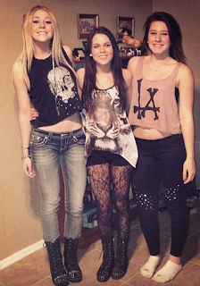 Above, an example of a group of female rock fans is shown. Black/grey high laced boots with scruffy faded jeans and out of proportion crop tops with skeleton faces and animal faces printed on them, netted/lace pattern tights with black shorts, leggings and wrist bands. All of these items of clothing suggest rebellion and a rock origin. They are all quite dark colours and something that you'd expect to see in a 'soft' 'indie' rock music video.
Its common that fans of the rock genre purchase t-shirts, wrist bands, caps, shoes and other clothing items with a statement/band logo printed over it. Above demonstrates a typical female audience wardrobe. These outfits are quite dark, but vibrant in their own way. They are quirky and different, which will draw attention (which is something that a rock genre aims to do - go against the norm, rebel, draw attention)
 Here is an example of what our female target audience would wear - with reference to the Sex Pistols - a popular rock band, even today. Also, Misfits, a programme containing teenage dramas like sex, drugs and raves (linking directly to rock - Sex, Drugs and Rock N' Roll).
Here is an example of the type of music that our predicted audience would listen to. Among the collection is reference to 'Thirty Seconds To Mars' - a less established (to all of every genre) band of the soft/indie rock genre. 'All Time Low', 'You Me At Six' and 'Deaf Havana' - which are closely related genres to ours. Our target audience will cling to physical CD's like this to show dedication to their band and to build a tangible collection. They will appreciate posters and live concerts. Our target audience would rather go out and do, rather than sit and appeal to their band only over a computer screen.
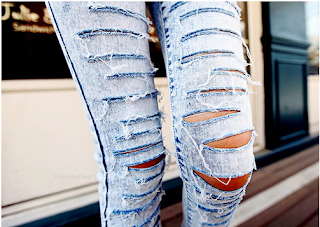 Ripped jeans are a common clothing type of the rock genre, as both genders can wear them. The ripped jean look enhanced the 'rebellion' that rock fans attempt to gain. It suggests a 'just rolled out of bed' or 'crazy night last night' look that creates mystery in their lives and enhances what people think of them, as they seem like a more interesting person. Someone who doesn't care - someone who challenges the norm.
Below, the hairstyle can be noted for both genders in that the 'sweeping fringe' was a common hairstyle for rock fans. We expect that our audience will have these sorts of hairdos. This hairstyle connotes insecurity and mystery. The sweeping fringe tends to hide the majority of the face, the forehead and eyes. Some of the shyer audience members will adopt this hairdo as a way of hiding their vulnerability (eyes) and by creating mystery to others. Also, it suggests quite a 'scruffy' overgrown look that defines the face. This hairdo is specific to 'hair flicking' or 'head bashing' (the action of fiercely nodding their head to the beat of the music - predictably heavy metal) - which is most common at raves.
Digipack Flat plan
Today I planned how my 6 photos will look for my CD case and booklet. I've chosen beauty shots, group posed shots, edited shots of all of their profiles combined, instrumental shots and so on - to enhance the feeling of musical talent and cool atmosphere to their and and music.
To list other songs in this alum, I've listed all 10 songs (including our track Vagabond) on a photo of a band members t-shirt which has the printed logo on it. We can make this happen through editing techniques and software materials.

 |
| Me experimenting with ways in which to show the song titles. |
How did you use media technologies in the construction and research, planning and evaluation stages?
I decided to create three separate videos for each area (research and planning, production and evaluation) as it will allow me to explore the technologies I've used in an in-depth manner. Also, I find that cramming three stages into one video can seem repetitive and may leave out vital information about how the technologies contributed to each stage.
Video 1 - Media Technologies I've used during the stages of research and planning.
Video 2 - Media Technologies I've used during the production stage
Video 3 - Media Technologies I've used during the evaluation stage
Video 1 - Media Technologies I've used during the stages of research and planning.
Video 2 - Media Technologies I've used during the production stage
Video 3 - Media Technologies I've used during the evaluation stage
Thursday 21 March 2013
photographs taken during filming
Group work, preparation and filming shots
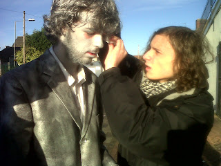 This picture shows Andrew (member of our group) applying the silver make-up to our actor James. Make-up and costume were essential features of our music video, so we had to constantly touch up on make-up and silver spray paint to keep the effect of the silver man realistic and flawless.
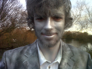 Regardless of the pressure of time and schedule, we still kept the atmosphere (away from filming) as friendly and relaxed as possible. If we all felt comfortable with eachother, then we were able to perform to the best of our ability. Also, to prevent a tense and perhaps grouchy atmosphere and thus preventing an enthusiastic mood.
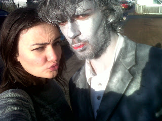 This picture demonstrates the relaxed atmosphere that we worked under and the general fun we had doing it. If you enjoy working on something, then you have ambition to make it as good as you can. This was the approach that we took on the filming day.
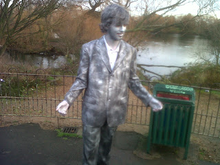 This shot clearly established how and why we decided to show James infront of the beautiful scenery behind. However, a less attractive public bin beside him was not easy to miss - so we had to be very creative with our shot in order to try and capture as little of the bin as possible.
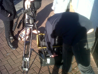 Here is a picture I took of the equiptment that we carried around that day, it includes a bag full of the make-up, costume and refreshments (as it was a long morning) as well as the big black case that protected the camera, which was quite heavy. It took at least 7 minutes for us to set up our camera and tripod, whenever we moved location (which, as shown by the music video itself) was a lot.
Here I am with the tripod, we all took individual turns, and even in pairs handling the camera and equiptment. Everyone had the freedom to film a scene of the music video, as well as helping carry the case and bags.
This photo was taken in an alleyway, the pavements were filthy, and the only decent backdrop we could find was the white painted brick wall. I chose to take these photos with James in front of this wall as the silver colour of his make-up and suit matched the white wall. I tried to capture as many shots of James in front of this wall, without the pavement revealing its unappealing nature as it did not suit the photo at all.
I took this picture with James standing infont of the wall, but at a distance where his shadow would not then be spread behind him on the wall. I'm happy with this photo as its set to a specific colour scheme and ties in well with the narrative performance.
The unfortunate part of this photo would be the door in the far background, and his shadow. I will try to edit these parts out, as not to look so unproffessional. As you can see, I wanted to get as many good shots of James' silver suit, perhaps as a representation of th narrative (hands folded behind his back suggest a gentleman, polite nature and so on).
I wanted to get shots of James' profile (side of his face) to make the album mysterious (like the music video) and to also resemble something like a prison sentence, when the suspects hold the plaque. The light in this image compliment the silver painting and make the silver glow to some extent.
This photo is the worst one I took. Although James is standing in a desirable position and angle, the shot also includes rubbish bins further down the street. Hopefully I can crop this out.
further webpage designs
Here I've experimented with different effects and edits to try and reach a rock effect. Above, I've explored the ways in which an image can be spread in different sizes and places to suggest the affect that drugs may have on someone. This supports the rock genre, as rock bands are known for their drug taking. Also, this could connote that the band has expanded in awareness and popularity, as the image expands behind it. This edited photo holds multiple connotations, which allows many suggestions on meaning to be welcomed.
Above, I've copied the suit image in a mirror-like effect and placed them on both sides to slightly border/frame the image. I've then placed an image of the lead singer in the centre of the photo, to suggest his importance within the group. Also, one can suggest that the silver suits on either side represent a rock background, or the rock spectrum - and having a mid-shot/close-up of the lead singer in the centre suggests that Lift Off differs from other rock bands, and in the 'faceless crowd' of the rock genre, the face of 'Lift Off' is different.
The title was applied to the picture in replacement of the main image - and it ties together the two mirroring pictures. This, for me, is the best edit as it clearly established the title in the centre, bordered by two suits on either side. 'Lift Off' is placed on the point of both images, as if the darkening of the silvering is leading to the introduction of the band. This suggests power and dominance.
Here I experiment with the mirror-like image to perhaps be the background of the digipack front cover. The silver colour scheme is consistant but clearly distinguishes the figures on either side. They create some sort of frame in the image.
Here is the final title for 'Lift Off' the silver colour scheme creates synergy among the products. The informal sans-serif font that infers comfortability and common use, as opposed to serif font that looks formal. We want to adopt the proffessional feel, but with an informal look. The circle replacing the 'O' gives the title a solid look to it, aswell as drawing the eyes of many viewers straight to it.
The title was applied to the picture in replacement of the main image - and it ties together the two mirroring pictures. This, for me, is the best edit as it clearly established the title in the centre, bordered by two suits on either side. 'Lift Off' is placed on the point of both images, as if the darkening of the silvering is leading to the introduction of the band. This suggests power and dominance.
Wednesday 20 March 2013
What have you learnt from your audience feedback?
To extend my data, I decided to directly interview a member of our target audience. Although females were our predicted niche audience, the three questionnaire results concluded that females took to our products more than we had expected. I wanted to gain a clearer insight on what appealed to them. Interviewing a member of our target audience, face to face, allows good, honest communication - where the audience member has freedom to express themselves and their opinions. This is helpful to us, as we want to get honest feedback.
I decided to approach this interview with an informal style, to encourage a relaxed atmosphere and thus help the interviewee to feel comfortable enough to explain in detail.
The main thing that I wanted to do, was directly interview a member of our main target audience, which was male, 15 - 20 years. I wanted to know what they thought of the whole package, whether or not they felt represented and whether or not they were the wisest choice of a main target audience (as the results from the three questionnaires told us that the niche female audience appealed to the product equally as much as the main target audience). Again, a relaxed, social atmosphere was reached to ensure comfortability and freedom from restrainting their thoughts.
I decided to produce three different questionnaires, each based on one of the three areas of my production (music video, digipack and webpage) - despite taking longer and considerably more effort in analysing each question, the results were significantly better and I gained a more indepth idea of what the audience thought. I was able to draw strong, conclusive points that were backed up by data and direct quotes.
Questionnaires are very useful in revealing data and ratings - however, in terms of the audience expressing their opinions, a questionnaire would be limited. Therefore (as shown above) I extended my research into their opinion, to gather stronger feedback.
Tuesday 19 March 2013
Practicing with LogoMaker software
I decided to experiment with the colour designs of my original logo, and try to find one that best suited the band style and webpage. The webpage colour scheme is silver, with a few flashes of vibrant colour, therefore I'm aiming for a proffessional, modern looking style.
 My first experimentation with my logo consisted of a dark golden colour, which, once placing it on my webpage I realised that the colour was too contrasting to match a silver background. I thought that if I tinted the colour slightly, that it may jel well with the colour.
Despite this, even when placing it on my webpage, I was still unsatisfied with how it didnt suit the colour scheme or style. From this, I decided to step away from golden coloured design schemes and look and silver colouring and more suitable styles for the webpage and band.
first day of editing
This year I've decided to take a leap at editing footage on my own as I crave creative freedom and an independent approach. I have had previous experience with Final Cut Express in group, and are therefore familiar with many of its features.
I have drawn up editing plans and have a rough visual of what I want the final outcome of the footage to be. I've taken into account that editing a whole music video by myself requires a lot of time and dedication, in of which to edit to its full standard. Therefore, I have arranged after school sessions that I can edit in.
I have drawn up editing plans and have a rough visual of what I want the final outcome of the footage to be. I've taken into account that editing a whole music video by myself requires a lot of time and dedication, in of which to edit to its full standard. Therefore, I have arranged after school sessions that I can edit in.
Friday 8 March 2013
Subscribe to:
Posts (Atom)


